Responsive Design Patterns
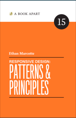
Responsive web design is an approach to building websites that ensures they look and function well on a variety of devices and screen sizes. This resource provides comprehensive information about responsive design patterns and principles.
Visit Full Resource
Author: Ethan Marcotte
Format: Online Resource/Book
Key Topics Covered
- Fluid Layouts and Proportional Thinking
- Responsive Navigation Patterns
- Media Queries and Breakpoints
- Mobile-First Design Approach
- Content Prioritization Techniques
- Responsive Images and Media
- Performance Optimization for Different Devices
Why This Resource Is Valuable
Ethan Marcotte, who coined the term "responsive web design" in 2010, provides authoritative information about implementing responsive design in modern websites. This resource is beneficial for:
- Web developers looking to improve their responsive development skills
- Designers seeking to understand how layouts adapt across devices
- Anyone creating websites that need to work effectively on mobile, tablet, and desktop
The principles and patterns covered in this resource remain fundamental to modern web development, even as new technologies emerge.